The align-content property aligns a flex container’s lines within the flex container when there is extra space in the cross-axis. This property has no effect on a single-line flex container.
Syntax:
.someflexcontainer {
  display: flex;
  align-content: stretch;
}
CSS property align-content
| CSS version: | CSS 3 |
| Value: | flex-start | flex-end | center | space-between | space-around | stretch |
| Initial: | stretch |
| Applies to: | multi-line flex containers |
| Inherited: | no |
align-content values
| stretch | 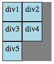 |
| flex-start | 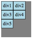 |
| flex-end | 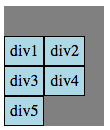 |
| center | 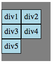 |
| space-between | 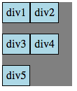 |
| space-around | 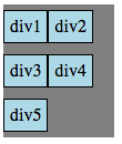 |
Example – align-content
In the following code, CSS property align-content can be changed to the following values
- stretch
- flex-start
- flex-end
- center
- space-between
- space-around
<style>
.fbox {
  display: flex;
  flex-wrap: wrap;
  align-content: stretch;
  width: 100px; background-color:gray; height: 120px;
}
.child {
  background-color:lightblue;
  border: 1px solid black; padding: 5px;
}
</style>

<div class=fbox>
<div class="child">div1</div>
<div class="child">div2</div>
<div class="child">div3</div>
<div class="child">div4</div>
<div class="child">div5</div>
</div>
align-content refresh
Specification and Browser compatibility
| Specification | Status | Categories |
|---|---|---|
| Flexible Box Layout Module | W3C Working Draft | CSS3 |
| Chrome | Firefox | IE | Edge | Safari | Opera |
|---|---|---|---|---|---|
| Yes 29+ | Yes 28+ | Partial 11+ | Yes 12+ | Yes 9+ | Yes 12.1+ |
| Android Chrome | Android Firefox | iOS Safari | IE Mobile | Opera Mobile |
|---|---|---|---|---|
| Yes 47+ | Yes 44+ | Yes 9.0-9.2+ | Yes 11+ | Yes 12.1+ |
source: caniuse.com


