InfoHeap
Tech
Navigation
  • Home
  • Tutorials
    • CSS tutorials & examples
    • CSS properties
    • Javascript cookbook
    • Linux/Unix Command Line
    • Mac
    • PHP
      • PHP functions online
      • PHP regex
    • WordPress
  • Online Tools
    • Text utilities
    • Online Lint Tools
search

CSS3 flexbox

    Flexbox container properties

    • display:flex and inline-flex
    • flex-direction
    • flex-wrap
    • flex-flow
    • justify-content
    • align-items
    • align-content

    Flexbox items properties

    • order
    • flex-grow
    • flex-shrink
    • flex-basis
    • flex
    • align-self

    Flexbox cookbooks

    • CSS flexbox - align div vertically and horizontally in center
     
    • Home
    • > Tutorials
    • > CSS
    • > CSS properties
    • > CSS3 flexbox

    CSS align-self – override align-items for flex-item

    on Sep 9, 2016

    CSS align-self property can be used to override align-items value (defined at flexbox level) for a specific flex-item.

    Syntax:

    .someflexcontainer {
      display: flex;
      align-items: flex-start;
    }
    .flexitem {
      /* Override align-items for a specific flex-item */
      align-self: flex-end;
    }

    CSS property align-self

    CSS version: CSS 3
    Value: auto | flex-start | flex-end | center | baseline | stretch
    Initial: auto
    Applies to: flex items
    Inherited: no

    flexbox-self-align

    Example – align-self

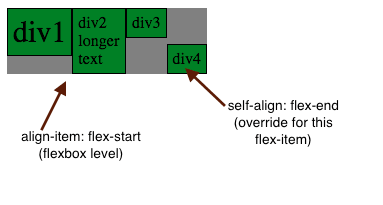
    This example uses align-items = flex-start. For one specific flex-item (last one) we override align-self to flex-end.

    <style>
    .fbox {
      display: flex;
      align-items: flex-start;
      width: 200px; background-color:gray;
    }
    .child {
      background-color:green;
      border: 1px solid black; padding: 5px;
    }
    </style>
    
    <div class=fbox>
    <div style="font-size:30px;" class="child">div1</div>
    <div class="child">div2 longer text</div>
    <div class="child">div3</div>
    <div style="align-self:flex-end;" class="child">div4</div>
    </div>
    refresh done
    try it online

    Specification and Browser compatibility

    SpecificationStatusCategories
    Flexible Box Layout ModuleW3C Working DraftCSS3
    Desktop
    ChromeFirefoxIEEdgeSafariOpera
    Yes 29+ Yes 28+ Partial 11+ Yes 12+ Yes 9+ Yes 12.1+
    Mobile
    Android ChromeAndroid FirefoxiOS SafariIE MobileOpera Mobile
    Yes 47+ Yes 44+ Yes 9.0-9.2+ Yes 11+ Yes 12.1+
    source: caniuse.com

    Suggested posts:

    1. CSS justify-content – flexbox children aligment
    2. CSS flex-grow – grow flex item if needed
    3. CSS align-items – flexbox items vertical alignment
    4. CSS order – flex items ordering
    5. CSS align-content – packing multiple flex lines
    6. CSS flex-wrap
    7. CSS flex – shorthand for flex-grow, flex-shrink and flex-basis
    8. jQuery – text input field – change keyup and paste events
    Share this article: share on facebook share on linkedin tweet this submit to reddit
    Posted in Tutorials | Tagged CSS, CSS properties, CSS3 flexbox, Tutorials
    • Browse content
    • Article Topics
    • Article archives
    • Contact Us
    Popular Topics: Android Development | AngularJS | Apache | AWS and EC2 | Bash shell scripting | Chrome developer tools | Company results | CSS | CSS cookbook | CSS properties | CSS Pseudo Classes | CSS selectors | CSS3 | CSS3 flexbox | Devops | Git | HTML | HTML5 | Java | Javascript | Javascript cookbook | Javascript DOM | jQuery | Kubernetes | Linux | Linux/Unix Command Line | Mac | Mac Command Line | Mysql | Networking | Node.js | Online Tools | PHP | PHP cookbook | PHP Regex | Python | Python array | Python cookbook | SEO | Site Performance | SSH | Ubuntu Linux | Web Development | Webmaster | Wordpress | Wordpress customization | Wordpress How To | Wordpress Mysql Queries | InfoHeap Money

    Copyright © 2025 InfoHeap.

    Powered by WordPress