The flex-wrap property controls whether the flex container is single-line or multi-line. It is flex container property.
Syntax:
.someflexcontainer {
  display: flex;
  flex-wrap: nowrap;
}
CSS property flex-wrap
| CSS version: | CSS 3 |
| Value: | nowrap | wrap | wrap-reverse |
| Initial: | row |
| Applies to: | flex containers |
| Inherited: | no |
Example – flex-wrap
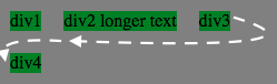
In the following code, CSS property flex-wrap can be changed to the following values
- nowrap
- wrap
- wrap-reverse
<style>
.fbox {
  display: flex;
  flex-wrap: nowrap;
  width: 250px; background-color:gray;
}
.child {
  background-color:green;
  margin: 10px;
}
</style>

<div class=fbox>
<div class="child">div1</div>
<div class="child">div2 longer text</div>
<div class="child">div3</div>
<div class="child">div4</div>
</div>
flex-wrap refresh
Specification and Browser compatibility
| Specification | Status | Categories |
|---|---|---|
| Flexible Box Layout Module | W3C Working Draft | CSS3 |
| Chrome | Firefox | IE | Edge | Safari | Opera |
|---|---|---|---|---|---|
| Yes 29+ | Yes 28+ | Partial 11+ | Yes 12+ | Yes 9+ | Yes 12.1+ |
| Android Chrome | Android Firefox | iOS Safari | IE Mobile | Opera Mobile |
|---|---|---|---|---|
| Yes 47+ | Yes 44+ | Yes 9.0-9.2+ | Yes 11+ | Yes 12.1+ |
source: caniuse.com


