Using CSS3 property transform, elements can be translated, rotated, scaled and skewed in two or three dimensional space. This tutorial will covered rotating an element using CSS transform (2D) rotate.
CSS Syntax:
transform:rotate(30deg);
Example
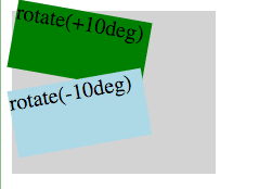
<style type="text/css">
.outer {
  width: 150px; height:120px; background-color:lightgray;
}
.box1 {
  width: 100px; height:50px; background-color :green;
  transform: rotate(10deg);
}
.box2 {
  width: 100px; height:50px; background-color: lightblue;
  transform: rotate(-10deg);
}
</style>

<div class="outer">
  <div class="box1">rotate(+10deg)</div>
  <div class="box2">rotate(-10deg)</div>
</div>
Specification and Browser compatibility
| Specification | Status | Categories |
|---|---|---|
| CSS3 2D Transforms | W3C Working Draft | CSS3 |
| Chrome | Firefox | IE | Edge | Safari | Opera |
|---|---|---|---|---|---|
| Yes 36+ | Yes 16+ | Yes 10+ | Yes 12+ | Yes 9+ | Yes 12.1+ |
| Android Chrome | Android Firefox | iOS Safari | IE Mobile | Opera Mobile |
|---|---|---|---|---|
| Yes 47+ | Yes 44+ | Yes 9.0-9.2+ | Yes 10+ | Yes 11+ |
source: caniuse.com


