Cross browser development and testing is very important to any web based tool or site. There are so many web browsers like Google chrome, Firefox, Internet explore (IE8, IE9, etc.), Safari on desktop and mobile platforms. It can be pretty difficult task to support all these browsers and test every product/site release and change on all browsers.
Luckily with browsers such as Google chrome and Firefox which auto update to latest version, things are somewhat better on these browsers. This article will cover some guidelines (and reasons) which I follow for cross browser development and testing.
Browser market share stats
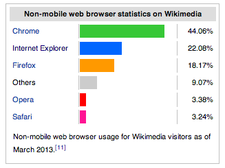
As per non mobile web browsee statistics on Wikimedia this is the distribution of various non mobile web browsers.
 And within internet explorer you can find the stats at Internet Explorer – Desktop Market share by year and version. From the April 2013 stats mentioned here, it can be concluded that IE8 (16.77%) and IE9 (25.87%) are most important Internet explorer web developers should care.
Comments on Cross browser development and testing
It is always better to test on maximum number of possible browsers on most platforms. But given the limited resources we mostly have, we can only do testing on limited browsers and platforms. Here are some practices I follow:
- Target Google chrome, Firefox, Safari and IE9 as your main browsers.
- Ensure that site pages degrade gracefully to IE8. Even though making everything work on IE8 is hard, but making major features of your site work on IE8 is not that hard.
- HTML5 has some great features and many of these don’t work on IE8. But these degrade gracefully on IE8. So its a good idea to use HTML5 features (like border radius etc) to provide richer experience of users of other browsers which support these features.
- Use VurtualBox with Internet explorer images if Mac is your primary development machine to test in IE8, IE9, etc.
- Jquery 2 does not support IE8 and old internet explorer browsers. So you may want to use Jquery 1.9 (or 1.x higher version whenever available).
- CSS3 is not supported by IE 9. So avoid using it till IE 10 gains significant market share.
- Mobile browsers (Android and iPhone) are usually ahead of Desktop browsers. So things usually work on these. If your site is a responsive site (which changes layout etc according to mobile browser screen size), then you want to test that as well.
- Within iOS I get most of my visitors from iPhone 6.x and iPad 6.x. You may want to check Analytics data (Google Analytics or some other analytics tool) and decide testing platforms accordingly.
- For Android, Android 2.3.x and 4.x are two most popular OS versions as per Android developer dashboard (May 1, 2013 data). So testing on these two android OS should cover most android users.