CSS input and textarea ::placeholder pseudo element can be used to add a placeholder text in input element. The text is set using input element attribute placeholder. The placeholder text can be styled using css placeholder pseudo element (or pseudo class in some browser). Note that pseudo class uses single colon (:) whereas pseudo element uses double colon (::) syntax. The support for css placeholder pseudo element is still prefix based in browsers (as on Feb 19, 2016).
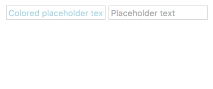
input placeholder css example
<style type="text/css">
.foo::-webkit-input-placeholder { /* chrome/opera/safari/edge */
  color:   lightblue;
}
.foo::-moz-placeholder { /* Firefox */
  color:  lightblue;
}
.foo:-ms-input-placeholder { /* IE 10+ */
  color:  lightblue;
}
</style>
<input class="foo" type="text" placeholder="Colored placeholder text">
<input type="text" placeholder="Placeholder text">textarea placeholder css example
<style type="text/css">
::-webkit-input-placeholder { /* chrome/opera/safari/edge */
  color:   lightblue;
}
::-moz-placeholder { /* Firefox */
  color:  lightblue;
}
:-ms-input-placeholder { /* IE 10+ */
  color:  lightblue;
}
</style>
<textarea placeholder="Textarea placeholder text" cols=40 rows=5>
</textarea>Specification and Browser compatibility
| Specification | Status | Categories |
|---|---|---|
| ::placeholder CSS pseudo-element | W3C Working Draft | CSS |
| Chrome | Firefox | IE | Edge | Safari | Opera |
|---|---|---|---|---|---|
| Partial 4+ (with prefix) | Yes 19+ (with prefix) | Partial 10+ (with prefix) | Partial 12+ (with prefix) | Partial 5+ (with prefix) | Partial 15+ (with prefix) |
| Android Chrome | Android Firefox | iOS Safari | IE Mobile | Opera Mobile |
|---|---|---|---|---|
| Partial 47+ (with prefix) | Yes 44+ (with prefix) | Partial 4.2-4.3+ (with prefix) | Partial 10+ (with prefix) | Partial 33+ (with prefix) |
source: caniuse.com


