CSS property cursor specifies the type of mouse cursor to be displayed on the element.
CSS property cursor
| CSS version: | CSS 3 |
| Value: | [ [uri [x y]?,]* [ auto | default | none | context-menu | help | pointer | progress | wait | cell | crosshair | text | vertical-text | alias | copy | move | no-drop | not-allowed | grab | grabbing | e-resize | n-resize | ne-resize | nw-resize | s-resize | se-resize | sw-resize | w-resize | ew-resize | ns-resize | nesw-resize | nwse-resize | col-resize | row-resize | all-scroll | zoom-in | zoom-out ] ] | inherit |
| Initial: | auto |
| Applies to: | all elements |
| Inherited: | yes |
cursor values
| value | Description |
|---|---|
| auto | Browser (User-Agent) decides based on the current context |
| default | The platform-dependent default cursor. Often rendered as an arrow |
| none | No cursor is rendered |
| context-menu | A context menu is available for the object under the cursor. Often rendered as an arrow with a small menu-like graphic next to it. |
| help | Help is available for the object under the cursor. Often rendered as a question mark or a balloon. |
| pointer | The cursor is a pointer that indicates a link |
| progress | A progress indicator. The program is performing some processing, but is different from wait as the user may still interact with the program. Often rendered as a spinning beach ball, or an arrow with a watch or hourglass. |
| wait | Indicates that the program is busy and the user should wait. Often rendered as a watch or hourglass. |
| cell | Indicates that a cell or set of cells may be selected. Often rendered as a thick plus-sign with a dot in the middle. |
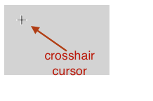
| crosshair | A simple crosshair (e.g., short line segments resembling a "+" sign) |
| text | Indicates text that may be selected. Often rendered as an I-beam. |
| vertical-text | Indicates vertical-text that may be selected. Often rendered as a horizontal I-beam. |
| alias | Indicates an alias of/shortcut to something is to be created. Often rendered as an arrow with a small curved arrow next to it. |
| copy | Indicates something is to be copied. Often rendered as an arrow with a small plus sign next to it. |
| move | Indicates something is to be moved |
| no-drop | Indicates that the dragged item cannot be dropped at the current cursor location. Often rendered as a hand or pointer with a small circle with a line through it. |
| not-allowed | Indicates that the requested action will not be carried out. Often rendered as a circle with a line through it. |
| grab | Indicates that something can be grabbed (dragged to be moved). Often rendered as the backside of an open hand. |
| grabbing | Indicates that something is being grabbed (dragged to be moved). Often rendered as the backside of a hand with fingers closed mostly out of view. |
| e-resize, ne-resize, nw-resize, n-resize, se-resize, sw-resize, s-resize, w-resize | Indicate that some edge is to be moved. For example, the se-resize cursor is used when the movement starts from the south-east corner of the box |
| ew-resize, ns-resize, nesw-resize, nwse-resize | Indicates a bidirectional resize cursor. |
| col-resize | Indicates that the item/column can be resized horizontally. Often rendered as arrows pointing left and right with a vertical bar separating them. |
| row-resize | Indicates that the item/row can be resized vertically. Often rendered as arrows pointing up and down with a horizontal bar separating them. |
| all-scroll | Indicates that the something can be scrolled in any direction. Often rendered as arrows pointing up, down, left, and right with a dot in the middle. |
| zoom-in | Indicates that something can be zoomed in and often rendered as a magnifying glass with a "+" in the center of the glass |
| zoom-out | Indicates that something can be zoomed out and often rendered as a magnifying glass with a "-" in the center of the glass |
| uri | e.g. url(/img/foo.png). x y represent exact position within the image which is the pointer position (i.e. hotspot). Cursor taken from image url. If image is not available, then next image or cursor value taken. |
Example css cursor
In the following code, CSS property cursor can be changed to the following values
- auto
- default
- none
- context-menu
- help
- pointer
- progress
- wait
- cell
- crosshair
- text
- vertical-text
- alias
- copy
- move
- no-drop
- not-allowed
- grab
- grabbing
- e-resize
- ne-resize
- ew-resize
- col-resize
- row-resize
- all-scroll
- zoom-in
- zoom-out
- url(/img/cursor.png), auto
<style type="text/css">
div {
  width:150px; height:100px;
  background-color: lightgray;
  cursor: auto;
}
</style>

<div></div>
cursor refresh
Specification and Browser compatibility
| Specification | Status | Categories |
|---|---|---|
| CSS3 Cursors (original values) | W3C Candidate Recommendation | CSS3 |
| Chrome | Firefox | IE | Edge | Safari | Opera |
|---|---|---|---|---|---|
| Yes 5+ | Yes 4+ | Yes 9+ | Partial 12+ | Yes 5+ | Yes 15+ |
| Android Chrome | Android Firefox | iOS Safari | IE Mobile | Opera Mobile |
|---|---|---|---|---|
| No | No | No | No | No |
source: caniuse.com


